When Gas Got Expensive, Summer Travel Didn't Retreat
What anonymized card-spend patterns reveal about how Americans traveled this summer

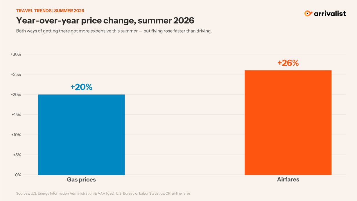
By mid-summer 2026, every price signal pointed to a pullback. Gas had climbed past $3.80 a gallon, up about 20% year over year; airfares had risen even faster, roughly 26%. The intuitive conclusion, that travelers stay home and trips get shorter, writes itself.
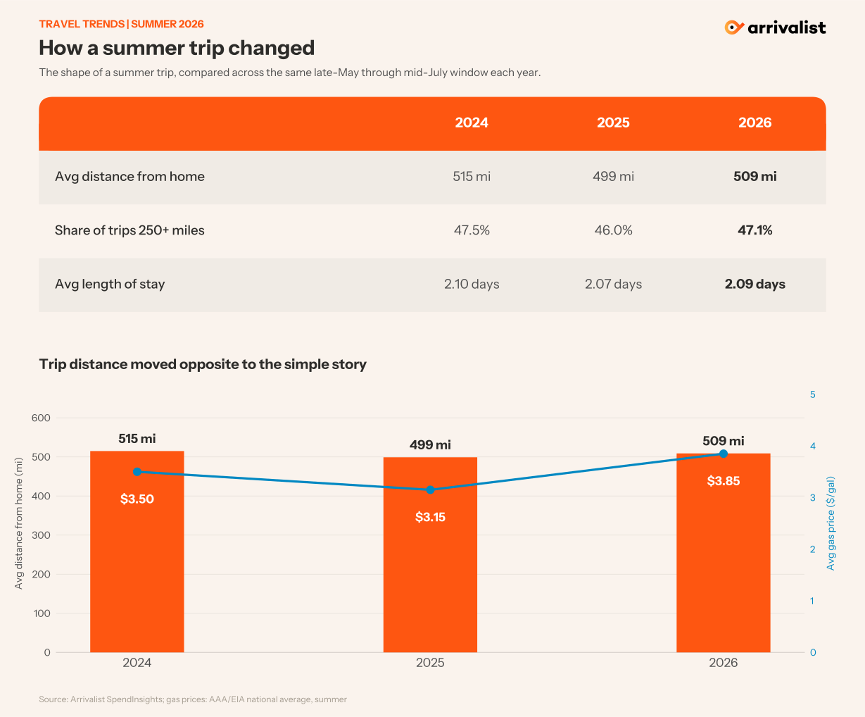
Anonymized card-spend patterns across the country tell a steadier story. Comparing the same late-May-through-mid-July window each year, and setting the World Cup host metros aside so tournament travel wouldn't distort the read, the shape of a summer trip barely changed. Average distance from home dipped in cheap-gas 2025 and climbed back in 2026 to sit right where it was in 2024. The share of genuinely long trips held near half. Length of stay didn't move.
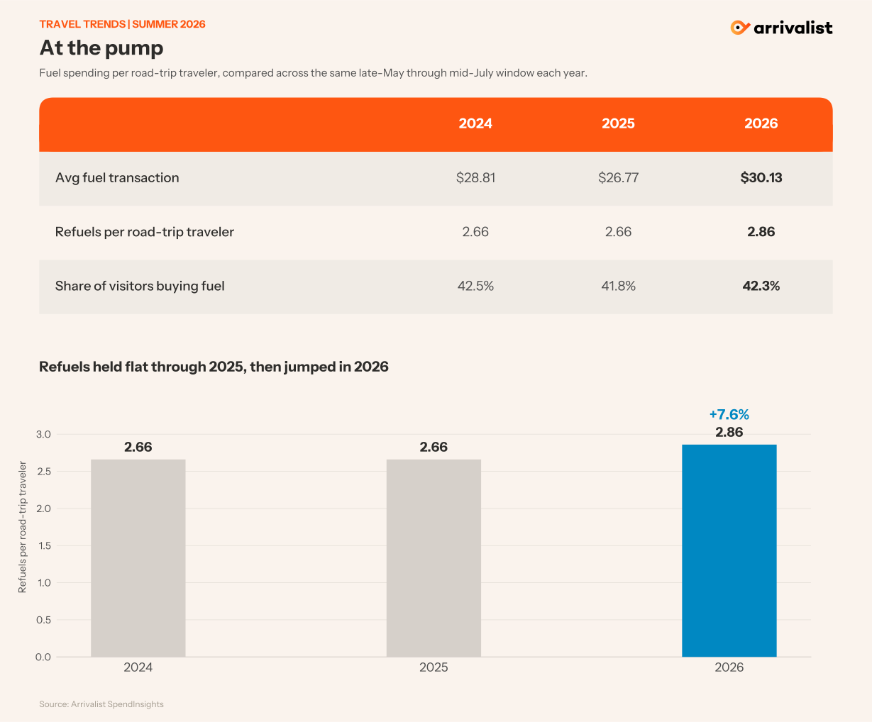
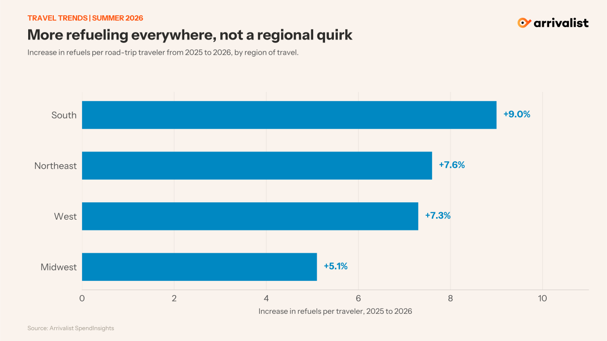
What did change is telling: travelers who drove refueled about 8% more often in 2026 than the year before, more stops per trip, the signature of longer routes, while the share of visitors buying fuel at all stayed flat. Spend at the pump rose, but that was mostly price: the average fill cost about 12% more — notably less than pump prices rose, because travelers spread their fuel across more, smaller stops.
The likely explanation isn’t that travel got cheaper. It’s that driving got relatively cheaper. Gas went up, but airfares went up more, and airlines trimmed their cheapest seats, so for anything within driving range, the car quietly won a few travelers at the margin. The pattern is consistent: when every option costs more and flying costs more still, people absorb the higher gas and drive.
For destinations, the takeaway is the opposite of the reflex. A fuel-price spike isn’t automatically a down season. In 2026 the belt-tightening showed up in how people traveled, not whether, which argues for leaning into drive-market and value messaging rather than bracing for demand to disappear.
Who kept traveling, who stopped, and which markets won — a more detailed analysis coming at the end of the summer.
────────────────
Source: Arrivalist SpendInsights. Figures are directional sample metrics from an anonymized card panel, not weighted population estimates. Comparisons use the same late-May through mid-July window across 2024-2026. Patterns are correlational and describe associations with the period, not causal effects of prices. World Cup host metros excluded. Gas and airfare figures: AAA/EIA and U.S. Bureau of Labor Statistics.